Skip to content

Scientific Logo Design

Logos engineered on science — then engineered to be found.

Kivashe designs identities using zone, line, shape, five-element and colour analysis — and ships them SEO, GEO and AEO ready, so search engines, generative engines and answer engines describe your brand exactly the way you intend.

  • Zone analysis
  • Five elements
  • Colour psychology
  • SEO · GEO · AEO

Live construction

Space
Earth
Fire
Water
Air
Upper zone — planning
Middle zone — communication
Lower zone — execution

The short answer

A scientific approach to logo design applies established evidence — gestalt grouping principles, colour psychology, figure-ground contrast, and memorability research showing that simpler marks are recalled far more reliably — instead of relying on the designer's preference alone. Every decision is justified against how human perception, recall and category association actually work, then stress-tested at favicon size, in monochrome, in motion, and against competitor marks.

The science

Six analyses run before a single curve is drawn.

Most logos are decided by taste. Ours are decided by what the mark actually signals — and then validated against how people, search engines and AI models read it.

Page & card orientation

The left field of a mark speaks to security, heritage and where a business comes from. The right field speaks to opportunity, expansion and where it is going. We place weight deliberately, so the mark reads forward instead of backward.

  • Left = security
  • Right = expansion

The three zones

Every mark is read in an upper, middle and lower zone — thought, communication and execution. A logo loaded only in the upper zone signals a company that plans and never ships. We balance the zones against your actual business model.

  • Upper: planning
  • Middle: communication
  • Lower: execution

Line & shape semantics

Vertical strokes indicate planning, horizontals indicate implementation, wavy lines read as unpredictability, and unintentional arrows quietly redirect a brand's momentum. Nothing enters the artwork without a reason.

  • Vertical = plan
  • Horizontal = execute
  • Arrow = direction

The five elements

Space is the circle (infinity), Earth is the square (stability), Fire is the upward triangle (ambition), Water is the downward triangle (flow), Air is the directional triangle (movement). A durable mark carries all five in balance.

  • Circle
  • Square
  • Triangle

Colour, contrast & recall

Colour psychology, figure-ground contrast, colour-blindness safety and monochrome survival are tested before a palette is signed off — because a mark that dies at favicon size dies in the feed.

  • Psychology
  • Contrast
  • Monochrome

SEO, GEO & AEO readiness

A modern identity has to be legible to machines as well as people: named SVGs, structured brand data, consistent entity naming and alt-text discipline so search engines, generative engines and answer engines describe you correctly.

  • SEO
  • GEO
  • AEO

Panch Tattva framework

Every enduring mark carries all five elements.

Space, Earth, Fire, Water and Air each have a geometric signature. When one dominates, the brand behaves like it — all Earth and it stalls, all Fire and it burns cash. We compose the balance your business model actually needs.

  • Space

    Infinity, scale, continuity

  • Earth

    Stability, trust, foundation

  • Fire

    Ambition, growth, energy

  • Water

    Flow, service, adaptability

  • Air

    Movement, reach, momentum

The process

The Scientific Logo Design process.

Six steps, fixed scope, no guesswork — from booking to a machine-readable final identity kit.

  1. Step 1

    Booking amount

    Your slot is confirmed and the diagnostic begins. We only take a limited number of identity engagements each month.

  2. Step 2

    Audit call

    We analyse your existing mark — zones, lines, elements, colour — and show you exactly what it is signalling today.

  3. Step 3

    100% fees

    Scope, deliverables and timeline are locked in writing. No scope drift, no surprise line items later.

  4. Step 4

    Strategy call

    Positioning, category codes, audience and the single idea the mark must carry are agreed before a pen touches a grid.

  5. Step 5

    Logo designing starts

    Marks are constructed on geometric grids using the five-element framework, then stress-tested at every size and in monochrome.

  6. Step 6

    Logo finalization

    Final files in every format, usage guidelines, machine-readable SVGs and trademark-readiness support.

Designed by Kivashe

Marks built to the framework.

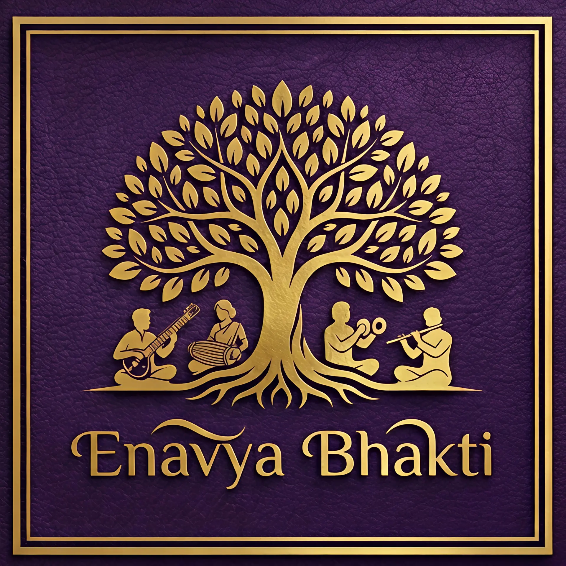
Enavya Bhakti logo designed by Kivashe — Devotional music & culture

Enavya Bhakti

Devotional music & culture

Space element in the canopy, Earth in the framed square, an upward growth axis through the trunk — heritage weighted left, expansion right.

Harsh Carpets logo designed by Kivashe — Premium carpets & furnishing

Harsh Carpets

Premium carpets & furnishing

A mandala seal anchors the security field on the left while the wordmark drives right — craft heritage and commercial ambition in one lockup.

Visibility engineering

An identity nobody can find is just decoration.

SEO

Search Engine Optimisation

Named, compressed SVG and WebP assets, descriptive alt text, consistent NAP and brand entity naming, and Organization schema that ties the mark to the business.

GEO

Generative Engine Optimisation

Brand facts written so ChatGPT, Gemini and Perplexity can lift them cleanly — a defined identity description, verifiable proof points, and consistent naming across every property.

AEO

Answer Engine Optimisation

Question-shaped brand copy and FAQ schema so answer engines quote your positioning verbatim instead of guessing it from a competitor's page.

What we deliver

Logo & mark design

A primary mark, its responsive variants, and the reasoning behind every choice.

  • Gestalt-based form development
  • Colour psychology and contrast testing
  • Responsive logo system
  • Legibility testing at every size

Full identity systems

Everything downstream of the mark, so the brand looks intentional wherever it appears.

  • Typography and colour architecture
  • Iconography and illustration
  • Photography and art direction
  • Motion identity

Brand guidelines

A usable document your team and vendors can actually follow.

  • Usage rules and clear space
  • Do and do-not examples
  • Digital and print specifications
  • Asset library and templates

Rebrand & migration

Changing identity without losing the equity you have already paid for.

  • Equity audit and risk mapping
  • Transition roadmap
  • Asset rollout across channels
  • Internal launch materials
Simpler marks are recalled markedly better
13%Simpler marks are recalled markedly better
Recall test standard we design against
3sRecall test standard we design against
Infinite responsive variants
1 markInfinite responsive variants
Guidelines and asset library
FullGuidelines and asset library

Request your logo

Tell us what your mark has to do.

Send the brief and we reply with a written first read on your current mark — zones, orientation, element balance — plus scope, timeline and investment. No obligation.

  • A written diagnosis of your existing logo
  • Scope, timeline and a fixed investment range
  • A named designer on the reply — not a sales queue

Your details go straight to our design inbox. We never share or sell them.

FAQ

Scientific logo design — questions we get asked

Grounding each decision in evidence about perception and meaning — page and card orientation, the upper, middle and lower zone balance, line and shape semantics, the five-element (Panch Tattva) geometry of circle, square and triangle, colour psychology and figure-ground contrast — then validating the mark through recall and legibility testing rather than personal taste.

Six steps: booking amount to confirm the slot, an audit call analysing what your current mark signals, 100% fees with locked scope, a strategy call to agree positioning and the single idea the mark must carry, logo designing on geometric grids using the five-element framework, and finalization with all formats, guidelines and trademark-readiness support.

SEO: named, compressed SVG and WebP files, descriptive alt text and Organization schema help search engines connect the mark to your business. GEO: consistent entity naming and verifiable brand facts let generative engines like ChatGPT, Gemini and Perplexity describe you accurately. AEO: question-shaped brand copy and FAQ schema let answer engines quote your positioning instead of guessing it.

Standalone marks from a serious studio typically start in the low lakhs; complete identity systems with research, guidelines and rollout cost more. The differentiator is the research and testing, not the drawing time.

A focused logo and identity engagement runs six to ten weeks. A full rebrand with migration across products, signage and channels typically runs three to six months.

Yes. You receive full ownership, source files, and every format your team and vendors will need.

Before you redesign anything, let's find out what your current mark is signalling.